Typography Is the Tell: What Your Typeface Admits About Your Brand Before Anyone Reads a Word
A brand will spend months on a logo and then set every word it publishes in a default font. I'd argue that's backwards. Type is read constantly while a logo is seen occasionally, and long before a customer finishes the sentence, the typeface has already told them how the brand sees itself, and how it sees them. Typography is the most honest signal a brand sends, precisely because it's the one it thinks no one is looking at.
Last updated: September 26, 2026
Most brands will spend three months and a serious budget agonising over a logo, argue for weeks about a colour, and then set every word they publish in whatever typeface came bundled with the template. The logo is treated as the brand’s face. Type is treated as plumbing: necessary, invisible, not worth a meeting.
I’d argue we have it exactly backwards. A logo is seen occasionally; type is read constantly. Every email, every pack, every caption, every contract a customer ever reads is set in type. And long before they finish the sentence, the typeface has already told them how the brand sees itself, and how it sees them. Typography is the most honest signal a brand sends, precisely because it is the one the brand thinks no one is looking at.
Type speaks before language does
Before a reader has processed a single word, they have registered its shape. A condensed grotesque and a high-contrast serif can carry the identical sentence and make it mean different things: one sounds urgent and industrial, the other composed and expensive. This happens beneath argument, in the half-second before comprehension. Type carries tone the way a voice carries mood down a phone line. You know something about the speaker before you have taken in a word they said.
This is why typography is not decoration sitting on top of the message. It is part of the message. A brand that has not decided what it sounds like has, whether it intended to or not, let a typeface decide for it.
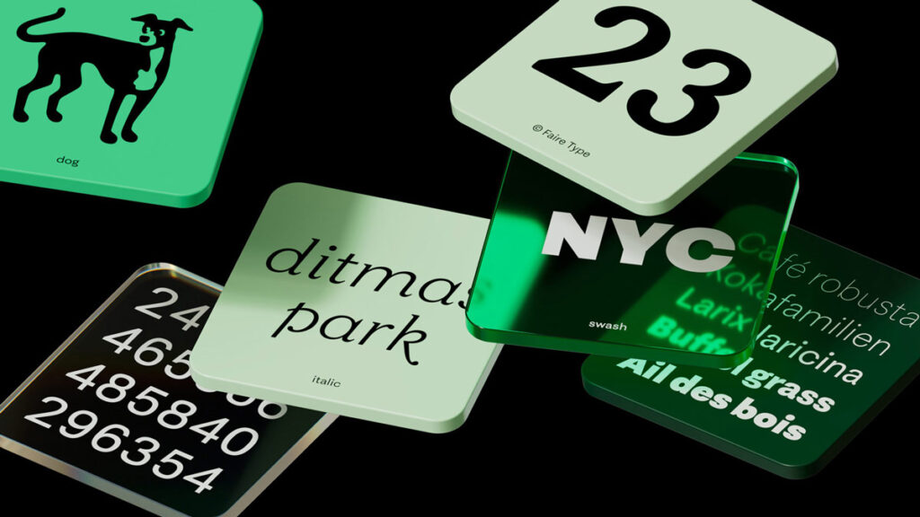
Where the dishonesty creeps in
A brand lies with type without ever meaning to. It happens in the gap between what a company claims to be and what its letterforms actually say. A building-materials brand that calls itself premium and then sets its price list in a tired system default is contradicting itself in a way no customer can name but every customer feels. The tagline says craftsmanship; the kerning says we did not care enough to check.
Inconsistency is the other tell. A crafted typeface on the billboard and a careless one on the delivery invoice quietly informs the customer which touchpoint the brand actually respects, and it is rarely the invoice. Customers do not consciously audit type. They simply come away with a feeling that something is a little off, and that feeling attaches itself to the brand long after the specific cause is forgotten.
A typeface is a system, not a decoration
The mark of a serious brand is not owning a beautiful typeface. It is owning a typographic system and having the discipline to hold it: a considered hierarchy, deliberate spacing, clear rules for how a headline relates to a subhead relates to body copy, and a small set of weights used well rather than a large one used at random.
The test of that system is never the pitch deck, where everyone is watching and everything is polished. The test is the unglamorous document. The warranty card, the HR letter, the vendor email, the spec sheet a sales rep prints in a hurry. A brand’s real type system is the one that survives contact with the people who were never in the branding meeting. Everything else is a mood board.

The bilingual blind spot
In our market there is a specific and revealing failure. A brand will invest in a considered Latin typeface for its English communication, then set its Bangla in whatever font renders by default: mismatched in weight, in warmth, in character, often visibly lower in craft. For a brand that speaks to Bangladesh, this is not a small oversight. It is a statement about which audience it took seriously.
Honest typography in a bilingual market means both scripts carry the same intent, the same craft, the same respect. A brand cannot credibly claim to be local while treating the local script as an afterthought. The script your customer thinks in is not the place to save money, and the reader feels the difference even when they could not tell you the name of the font.
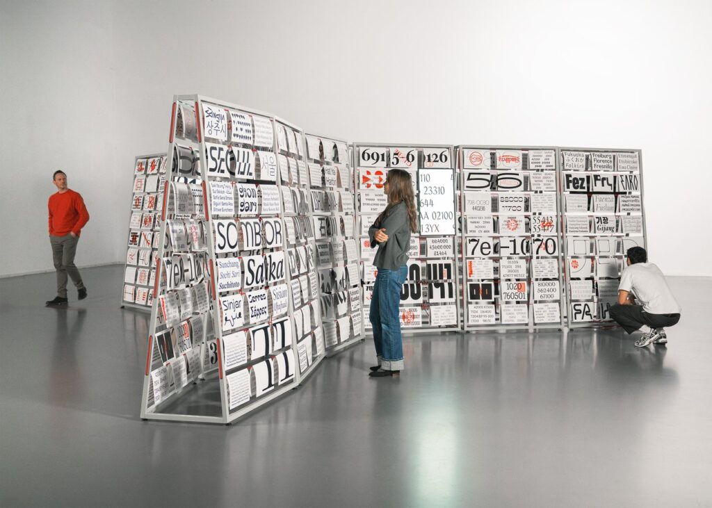
What type honesty actually requires
It requires choosing letterforms that match the truth of the brand rather than its aspiration. A modest brand set in convincing, well-made type reads as more honest than one dressed in borrowed luxury. It requires building a real system: a few weights, a clear hierarchy, rules written down. And it requires the hardest thing of all, which is enforcing that system on the surfaces no one is watching, because those are precisely the surfaces that tell the truth.
The real question
The useful question for a leadership team is not “do we like this typeface.” It is: does the way we set our words match the thing we claim to be? Type is where a brand’s stated values meet its actual discipline, and the two are either aligned or they are not. You can brief a copywriter to say the right things. You cannot brief a typeface to lie convincingly. That is exactly what makes it the most honest thing a brand owns.
Key takeaways
- Type is read constantly while a logo is seen occasionally, yet most brands invest in the logo and leave the type on a default.
- Typography carries tone before language does. Readers register a brand’s character before they finish the sentence.
- A brand contradicts itself when its type does not match its positioning. A premium claim in a careless font reads false, even when the reader cannot say why.
- Consistency across unglamorous touchpoints such as invoices, letters and spec sheets is the real test of a type system, not the pitch deck.
- In bilingual markets, treating the local script such as Bangla as an afterthought signals which audience the brand actually respects.
- Type honesty means choosing letterforms that match the brand’s truth, building a disciplined system, and enforcing it where no one is watching.

Written by
Shahriar Zaman
Brand strategist and fractional CMO with 15 years of building category brands. Founder of Ads of Bangladesh and co-founder of Brand Practitioners Bangladesh. Based in Auckland.