Brutalism, Neobrutalism, and Minimalism: What Three Design Philosophies Teach Us About Brand Honesty
Last updated: July 25, 2026
There's a question I keep returning to as a brand strategist: when does a design choice become a statement of values, rather than just an aesthetic preference?
Nowhere is this clearer than in the ongoing conversation between Brutalism, Neobrutalism, and Minimalism; three design languages that, on the surface, look like opposing camps, but underneath are all answering the same question differently: how honest should design be about what it actually is?
This isn’t a UI/UX piece. I’ll leave the pixel-level breakdowns to the designers who live in Figma every day. What interests me is what these movements say about brand posture, because every one of these styles is, at its core, a trust signal. And trust signals are exactly the kind of thing a marketer should be paying attention to.
Brutalism
The Brand That Refuses to Perform
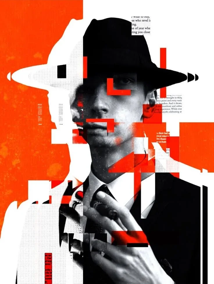
Brutalism began life in 1950s architecture, where raw concrete was left exposed rather than dressed up, the building told you exactly how it was made, with nothing hidden behind plaster or paint. When that philosophy migrated into digital design decades later, it kept the same instinct: expose the structure, resist decoration, refuse to smooth things over for the viewer’s comfort.
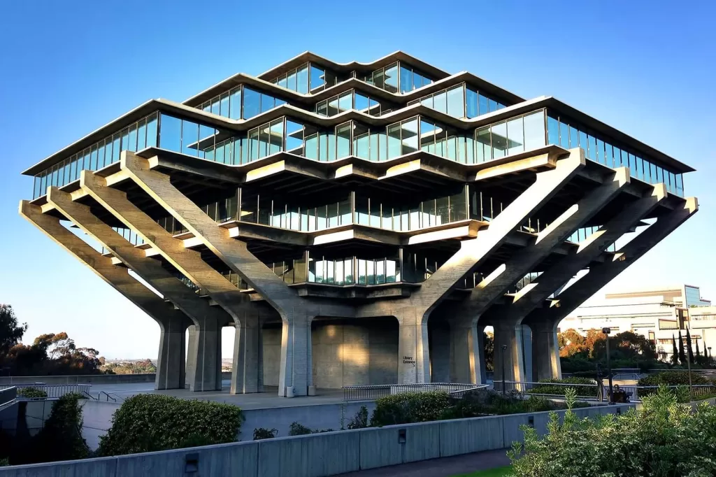
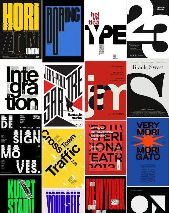
For a brand, adopting a brutalist visual language is a deliberate act of defiance. It says: we are not here to be liked in the conventional sense, we are here to be undeniable. That’s a difficult position for most commercial brands to hold, because it trades approachability for authority. It’s why you rarely see brutalism in banking, insurance, or healthcare categories where the brand’s entire job is to lower anxiety, not raise it. But in creative industries, publishing, fashion, and cultural institutions, that same rawness reads as confidence. It works precisely because it doesn’t ask for permission.
The strategic lesson here isn’t “use bold typography.” It’s this: friction, used deliberately, can be a form of credibility. A brand willing to look unpolished is implicitly claiming it doesn’t need the gloss to be taken seriously.

Neobrutalism
Confidence Without the Cold Shoulder
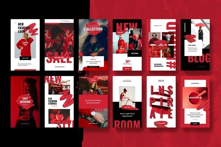
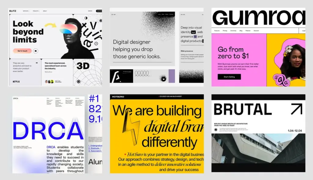
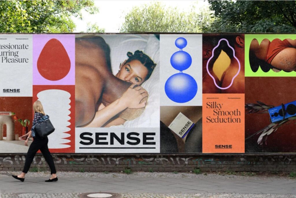
Neobrutalism is what happens when that same defiant instinct gets a sense of humor. It borrows brutalism’s boldness, thick borders, high-contrast color, blocky structure; but softens the edges with playfulness: bright palettes, chunky drop shadows, a slightly nostalgic wink toward early internet interfaces. The result reads less like a challenge and more like an invitation.
This is, I’d argue, the more commercially viable sibling of the two. Neobrutalism has found real traction with startups, SaaS products, and youth-facing brands precisely because it lets a company look distinctive and a little irreverent without sacrificing usability. It’s brutalism that has learned to shake your hand.
The strategic lesson here isn’t “use bold typography.” It’s this: friction, used deliberately, can be a form of credibility. A brand willing to look unpolished is implicitly claiming it doesn’t need the gloss to be taken seriously.
Minimalism
Confidence Through Restraint
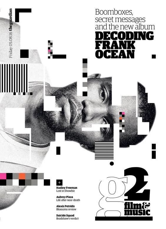
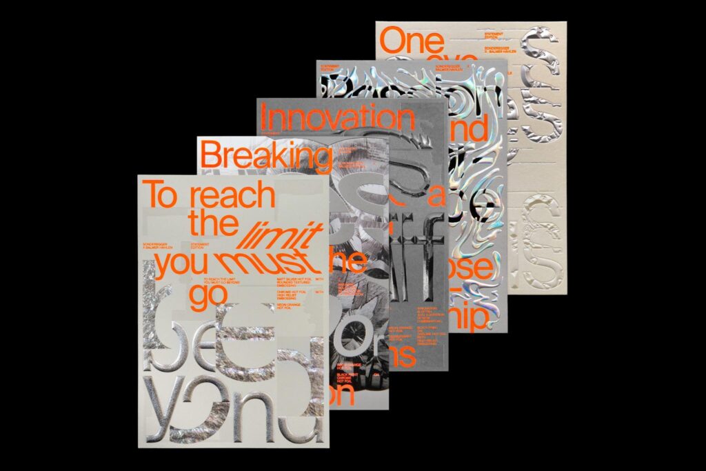
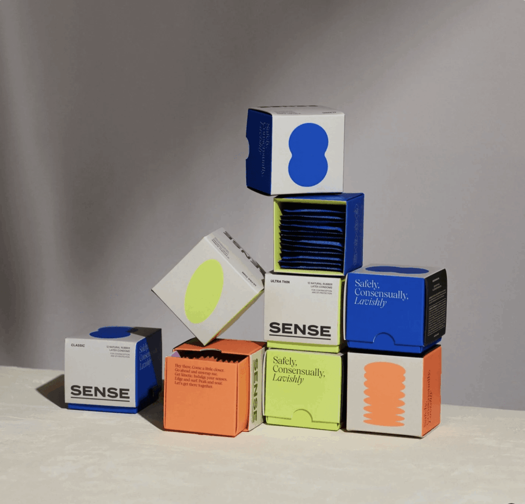
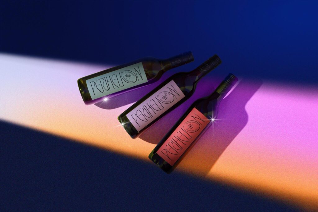
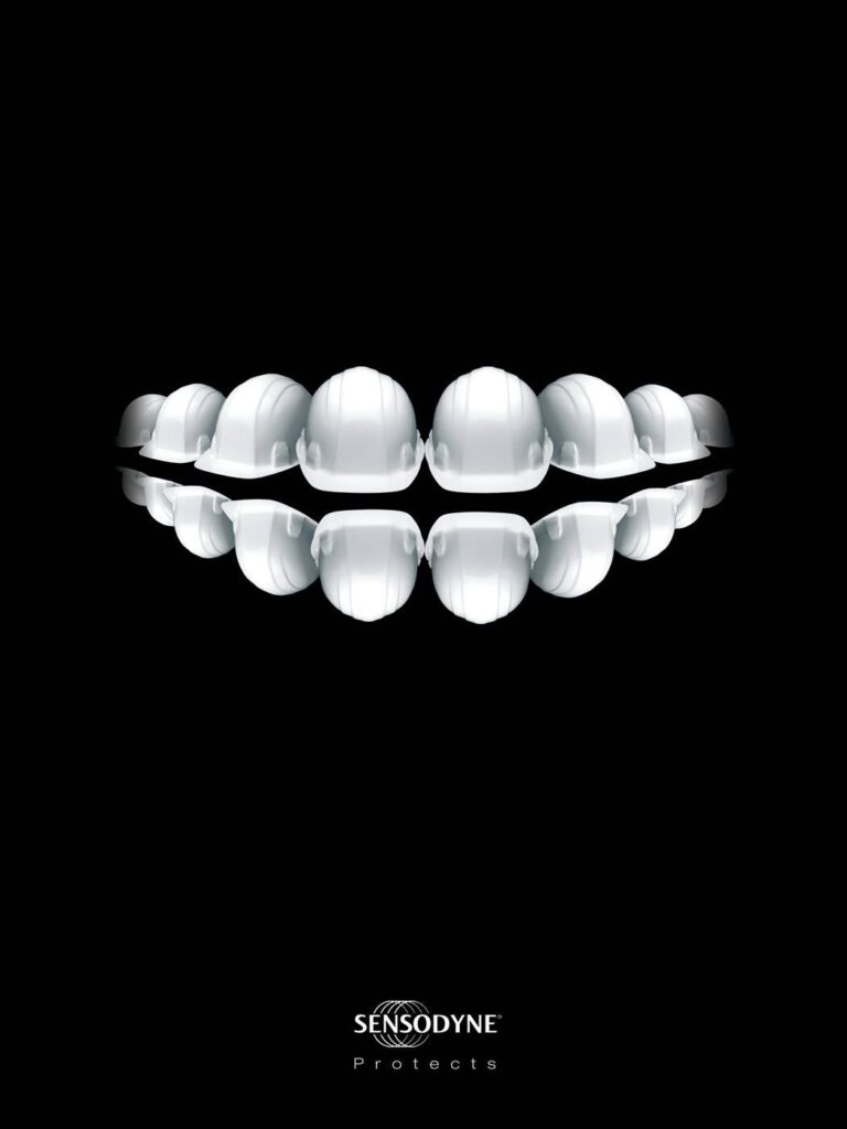
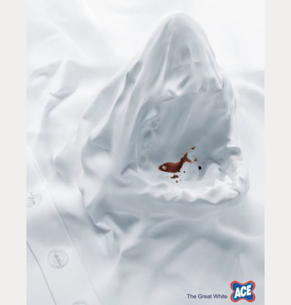
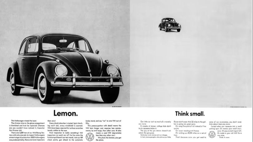
Minimalism takes the opposite route to the same destination earning trust not through raw honesty or playful boldness, but through restraint. Strip away everything that isn’t essential, and what remains carries more weight by default. It’s a philosophy that made its way from 1960s art and architecture into nearly every category of modern design, and it has aged remarkably well because its underlying logic clarity beats decoration, never really goes out of fashion.
The common misreading of minimalism is that it’s the “safe” or “boring” choice. In practice, minimalist design is often the hardest discipline to execute well, because every remaining element has to justify its place. There’s nowhere to hide a weak idea behind a good font or a clever animation. That’s precisely why so many premium and luxury brands gravitate toward it, restraint reads as confidence, and confidence reads as quality. A brand that doesn’t need to shout is implicitly telling you it doesn’t need to convince you of anything.
Same Question, Three Different Answers
Line these three up side by side and the pattern becomes clear:
- Brutalism earns trust by exposing everything.
- Neobrutalism earns trust by being loud but structured.
- Minimalism earns trust by removing everything that isn’t necessary.
None of these is objectively superior the right choice depends entirely on what a brand needs to prove to its audience, and in which category it’s operating. A fintech startup trying to look trustworthy to a first-time investor probably reaches for minimalism. A culture magazine trying to signal that it isn’t afraid of anyone reaches for brutalism. A consumer app trying to feel fresh, human, and slightly rebellious without scaring off mainstream users often lands on neobrutalism.
What ties all three together is that none of them are really about decoration at all. They’re about what a brand is willing to say about itself before a single word of copy is read. That’s worth remembering the next time a design brief comes across your desk, the aesthetic isn’t the strategy, but it is almost always making a claim on the strategy’s behalf. Best to make sure it’s making the right one.

Written by
Shahriar Zaman
Brand strategist and fractional CMO with 15 years of building category brands. Founder of Ads of Bangladesh and co-founder of Brand Practitioners Bangladesh. Based in Auckland.